


Persona Digitalia is a fine object: a simple stapled booklet, printed in full colour on good quality off-white bookwove, with uncoated cover. Like Shirley’s earlier works of photo poetry, it has the look and feel of both a miniature exhibition and something that should itself be exhibited. The temptation is to remain at its periphery, like a visitor at an art gallery, taking in the effect. At the same time, I found it worth spending time with individual pieces and trying to unpick them, even at the risk of unravelling the overall impression.
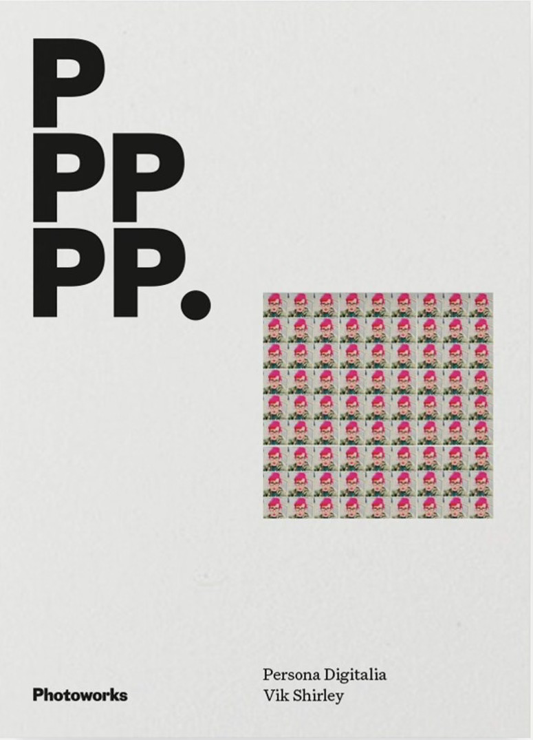
‘Kaleidoscopic’ is a beautiful word that has become slightly detached from its original meaning, I would guess because it sounds and looks so lovely. Critics tend to use it to mean ‘colourful and varied’, but it more accurately describes a series of disorientingly dense, bright patterns formed from direct repetition and mirroring. Persona Digitalia is genuinely kaleidoscopic; its visual component constitutes saturated, posterized pop art images repeated in rows and tables. Each image appears 81 times on a right-hand page (here they are just large enough to discern) and 729 times on the left-hand page, where they become a loud, strange sewing pattern. At the bottom of each spread there is a language component: three lines comprising short descriptive statements, like tent ropes lashing down a big top as the wind threatens to carry it off.
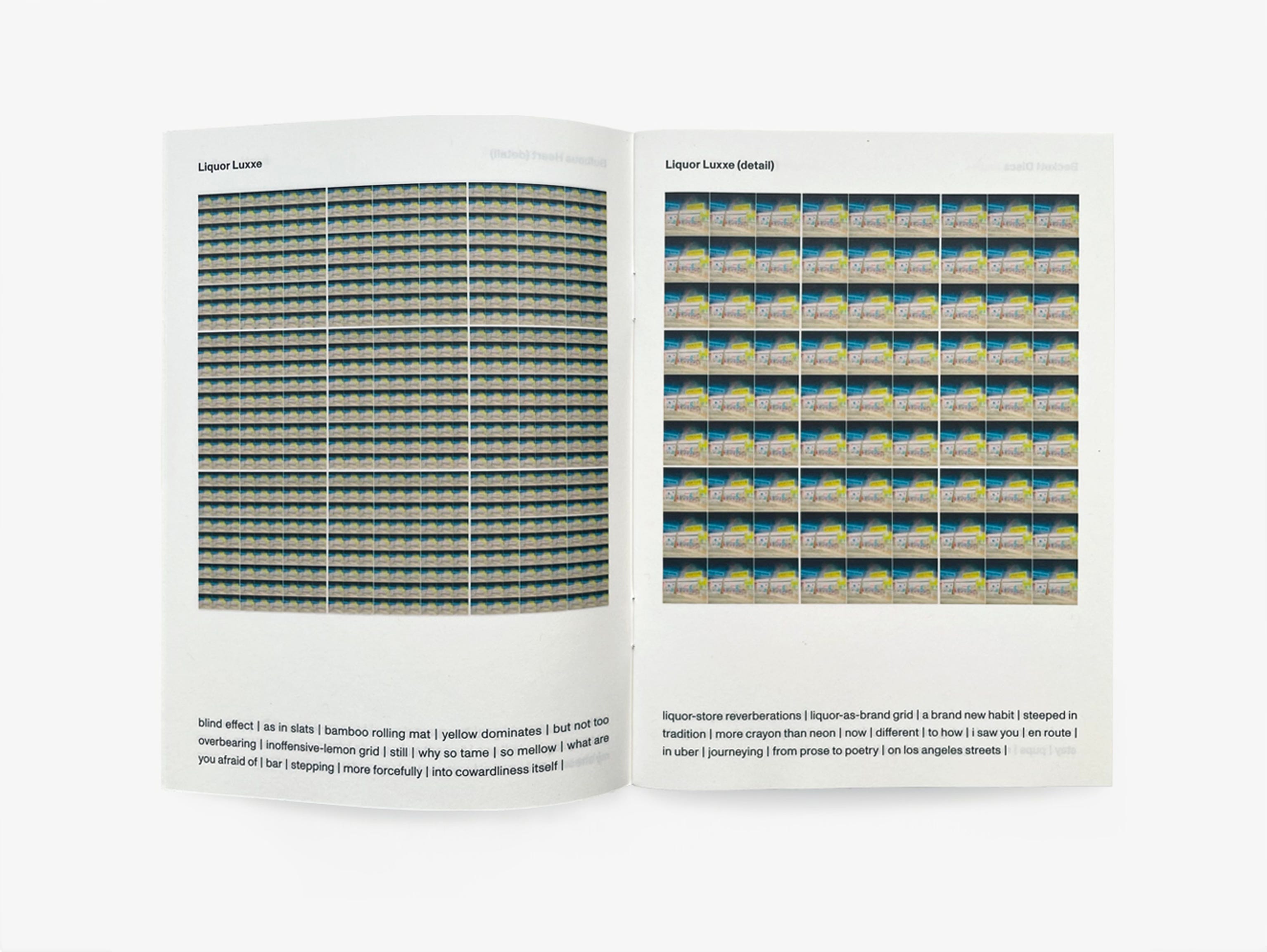
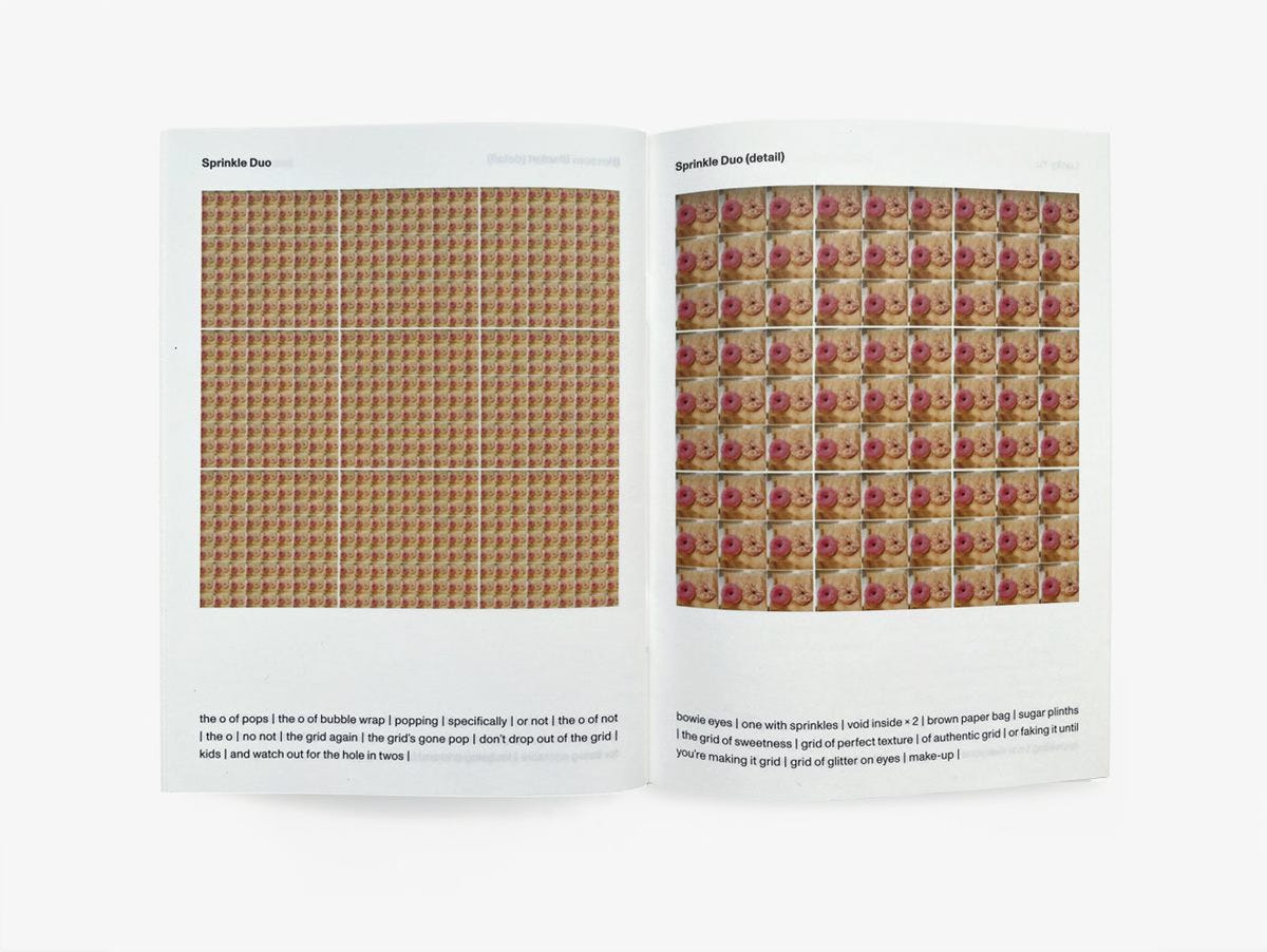
One obvious reading strategy is to study each bank of images, decide what you make of it, then read the accompanying poetry, then look back to the images to see if and how the idea works. For example, in the case of ‘Mother of Illusion (detail)’, I thought I could make out a woman in a bikini, seen from the perspective of someone looking through dark, water-speckled sunglasses. The repetition of this image might represent a kind of mental logbook – how many times the observer has played the moment back in their minds. The poem gives me “bauble or glass […] a vessel filled with bourbon”, and turning back, I can now perceive each cell as a full glass tumbler, light glinting off ice – though the colour and quantity of drink puts me more in the mind of a Jack Daniels and coke.
The next bit of poetic text is: “switch to an eye”. A compound eye? That makes sense in terms of my wet sunglasses impression. Then: “me and my b-boy | imprinted on lens” – harder for me to see two figures dancing, unless each cup of the bikini top is a knee and the figures are similarly dressed in bright orange. Perhaps the lens belongs to a paparazzo or sports photographer?
Next: “a murderer’s face | imprinted on the grid | imprinted on the victim’s retina”. This is disturbing – is the murderer’s face supposed to be there in every image (again, each bikini cup a seething red eye), or should it emerge from the whole page, as in a photo mosaic? Am I the victim, not seeing the murderer approaching? Is the table of images a sort of shattered disk drive retrieved from the victim’s brain, such that the face of a murderer can be reconstructed from it?
Persona Digitalia is genuinely kaleidoscopic
Persona Digitalia’s introduction makes it clear that the pieces should be read in pairs, and that this simulates “the indecision of life; the desire to want both things”, i.e. to carry out a close-up inspection while also keeping your distance. So in ‘Mother of Illusion’, the piece on the page facing ‘Mother of Illusion (detail)’, any semblance of bikini and human figure fades to the texture of a leather armchair. The accompanying poem-text reads: “me and my joy-boy | hidden here | bound together”. I take ‘joy-boy’ to mean something similar to ‘toyboy’, given that leather furniture perhaps suggests slightly risqué romantic liaisons, further reinforced by: “grid of delights | distinguished hues | mulled wine | tight-knit grid | we need it up here | in winter”. Again, “mulled wine” fits the colour, and the other images leave the impression of a holiday tryst, as experienced by someone blearily drunk – certainly a softer scenario that that envisaged in the facing poem, with its implicitly violent “imprinting”.
This relationship between opposing pages repeats itself throughout the book, though not always as starkly. Left tends to be fuzzier, more pastel-hued (for example “mortar yarn and stutter”, “in blush”, “bamboo rolling mat”, “silk slithers”, “seka-peach-soft-candy”) while right is more likely to invoke sharp edges, hard surfaces, heavy emotions (“your angles are becoming”, “will you be my stress ball | wall”, “liquor-store reverberations”, “spewing limbs of ribbons”, “black-sticker”). It would be remiss of me not to note that some of the poems work prettily on their own, using the accompanying montage as a cue to draw together fragments of memory and experience linked by shade or tone. Here, for example, is ‘Self Portrait Candies’:
running with the pink | as if life | depended | pink slips | pink-vinyl immersion | malleable lilo | sink-swallowed | with pink cocktails | pink pigtails | extreme pink tendencies | i’ll be locking myself in | forever | this pink grid |
Other sections remind me of Frank O’Hara’s chatty, coke-top-popping style (O’Hara was himself influenced by abstract impressionism, of course) though the vertical bars – here functioning as an alternative to line breaks – get too much in the way of syntax for any casual chain of thought to pick up speed. In fact, the frequent impression is of someone interrupting themselves as they try to piece something together. Sometimes there’s even an interesting sense that the two sides of each spread are trying to be heard over the top of one another, fighting for attention.
For that reason and others, I found it best to read lightly, to not squeeze the poems too hard. As a reading experience, Persona Digitalia works best when you situate yourself somewhere between the gallery viewer and the poetry detective, sticking your nose in here and there to draw out a satisfying extra nuance without expecting any part to suddenly resolve itself into a clear message. Stand back, squint a little, enjoy the colours.
Jon Stone is a Derbyshire-born, Cambridge-based writer, editor and researcher. He has previously won an Eric Gregory Award, the Poetry London Prize (twice), the Live Canon International Poetry Prize and the Sarabande Chapbook Prize. As one half of Sidekick Books, he edits the ongoing 10 Poets series with Kirsten Irving. His most recent publication is Instar Hotel (Sarabande, 2026).
Vital Statistics: The Friday Poem has 3800-plus subscribers. It’s run by four people – Hilary Menos (Editor), Helena Nelson (Consulting Editor), Bruno Cooke (Spoken Word Editor) and Andy Brodie (Web Editor), with contributions from a team of reviewers and writers.
Until recently we maintained the Friday Poem website (thefridaypoemdotcom) as an archive of 700 posts published between 2021 and 2024 (including most of the original Friday poems) but following a catastrophic hack in late April we made the difficult decision to take this down. We’ll be republishing some of the poems, features and reviews on Substack in the future.
Help support The Friday Poem
Buy us a coffee to help us stay awake as we strive to bring poetic excellence to your inbox every Friday. Heartfelt thanks to everyone who donates, especially to our regular donors. If you can’t afford it, no worries, we’re going to keep on doing it anyway! Big thanks for everything, you lovely poetry peeps.